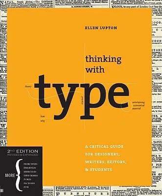
Thinking with Type, 2nd Edition by Ellen Lupton
Insights from Thinking with Type, 2nd Edition
Screen reading changed everything about how we see letters. Backlighting and pixels make us look at text differently than ink on a page.
“Design is as much an act of spacing as an act of marking.”
Hierarchy doesn't have to be loud. Small shifts in weight or a simple indent can guide someone's eye much better than a giant bold font.
“The grid is a tool for organization and communication.”
Grids aren't meant to be cages. They actually give you the freedom to break the rules once you know where the lines are.
“Typography is what language looks like.”
Letters are just shapes until they start talking. I realized how much the space between them changes the whole mood of a sentence.
- Language
- EN
More by Ellen Lupton
See all →
Design Is Storytelling
Beautiful Users: Designing for People
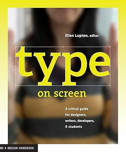
Type on Screen: A Critical Guide for Designers, Writers, Developers, and Students
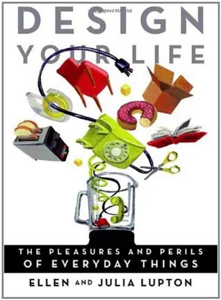
Design Your Life: The Pleasures and Perils of Everyday Things
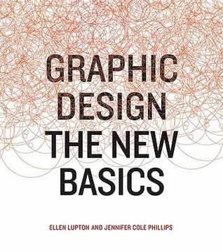
Graphic Design: The New Basics
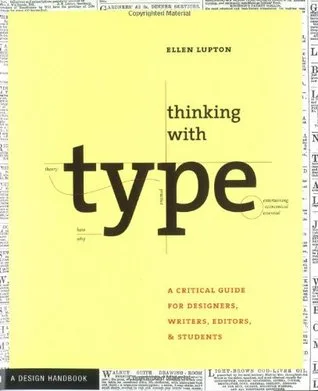
Thinking with Type: A Critical Guide for Designers, Writers, Editors, and Students