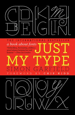
Simon Garfield chronicles the evolution of letterforms from Gutenberg’s mechanical press to the digital screens of the twenty-first century. He investigates how specific typefaces, such as Gill Sans and Helvetica, acquired their distinct cultural personalities and political associations. The narrative examines the technical craftsmanship behind font design, the fierce competition between legendary typographers, and the aesthetic rise of the IKEA catalog. By detailing the engineering of the ampersand and the notoriety of Comic Sans, the book explains how visual shapes influence the interpretation of written language.
This book serves graphic designers, history enthusiasts, and curious observers of visual culture. Readers learn to identify common typefaces in urban environments and understand the psychological cues triggered by different serifs and spacing. The text provides the vocabulary to discuss kerning and legibility while explaining why certain fonts signify authority and others project informality. Someone finishing this volume will recognize the intentionality behind every movie poster and street sign they encounter, gaining a technical appreciation for the geometry of the alphabet.
Practical, outward-looking and clear-cut; an easy read.
Best for readers like The Practical Optimizer. Which reader are you?
- Published
- 2010
- Language
- EN